- Consider your basic needs when dressing a window. Is a light-blocking shade called for in a bedroom? Are blinds required to direct the afternoon sun in a family room? Is there a good view to be enhanced, or a bad one to hide with a layer of filmy sheers? Address these issues first, and move on to the desired design, color and pattern to complement the other furnishings in the room.
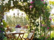
- Curtains and other window treatments should be compatible with a room's style. If your decor is contemporary, use simple, streamlined treatments such as shades, vertical blinds or panels with grommets. Hang velvet or brocade curtains or drapes in a Tuscan-style room. A country decorating scheme is suited to ruffled tiebacks or gingham cafe curtains and valances. Traditional interiors call for elaborate treatments, such as floor-length draperies, padded cornices or swags with tassles.
- Make small windows seem bigger by extending curtain panels 1 foot or more beyond the frame on each side. Make a low window seem taller by installing a rod near the ceiling and hanging valances that reach a few inches below the top pane. Design professionals can create dramatic looks, but if one isn't in the budget, use a few tricks to add custom style to ready-mades. Apply tassels, cording, ribbon or a band of solid fabric at the top or bottom edge of a curtain. Drop small weights into the hems to make drapes hang well. Sew a fine wire into the edge of a valance or curtain to create a pliable edge to mold.
- If you lack the design confidence to choose a window treatment, look for styles made to coordinate with each other, such as bed-in-a-bag options with matching comforters and valances. If you're sewing your own curtains, fabric stores group coordinating fabrics together, taking out the guess work.
Amy Wax, color consultant and author of ''Can't Fail Color Schemes," believes different colors can affect the mood of a room, whether used on walls, upholstery or curtains. Yellow is a warm, cheery hue, but it may over-stimulate a child if used in a playroom, she writes. Blue is a restful, calming color often used in a bedroom. Red is flattering to all skin tones and is said to stimulate the appetite, making it a good choice for a kitchen or dining room.
Function
Style
Tricks
Color and Pattern
SHARE


