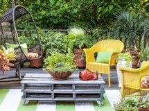
To color or not to color: this always seems to be a prime question when it comes to turning your house into a home. Taken to extremes, there appear to be those who frown on colors, preferring the utilitarian monotony of cool beige, magnolia or white. Then, of course, there are those who enjoy the exhilaration of the language of color. Color is known to have an effect on the mood of a person and can affect them adversely as well as beneficially. This has been well-known for many years and is used to considerable effect in dental surgeries, hospitals and schools. However, many people look on color decorating ideas with a mixture of horror and apprehension. Color worries them, perhaps because they are not comfortable enough with the way colors and shades can work together or repel each other so prefer to stay safe and stick to magnolia. To other people color decorating ideas begin and end with the little bits and pieces - the accessories - they add after they have finished decorating the whole of their home in neutral shades.
None of these ideas are wrong and if the choice suits the person's personality then the color decorating ideas have worked for them. For other people, the ones who really would like to use color if only they knew how, there are a few basic principles to follow in order to achieve the best effect. Once you understand how those principles work, then it is possible to alter those principles slightly to achieve the added wow-factor that can be achieved without too much difficulty. You do need to know about primary colors and secondary colors: which colors you can mix to achieve another color. From this array of colors you then begin to develop a palette of shades and hues - the so-called color wheel that you see in all the DIY shops and paint shops.
It is in understanding what to do with the shades that can make or break any color decorating ideas. If you have a color you intend to use as an accent color, never use too much otherwise it will cease to be an accent: about 10% is sufficient. Any more is too much. After your accent color, add your background color. This should involve 60% of the color in the room. If in doubt, think of one wall with an accent color and three walls with the background shade. For a tertiary color, think of the ceiling and any coving, doorways and windows: around 30%. One of the principles to follow is keeping your background color as your palest hue. I never do this. I always keep my palest color for the tertiary color. When you understand colors, this works very well but you do have to understand how you can incorporate a basic color and then adjust different shades from another basic color to either tone in or to contrast without clashing.
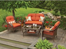
Color decorating ideas, to me, are just that: ideas to be played with. Through experimentation you will soon learn that, yes you can use deep plum on one wall and a deep pink on the other three walls, with a terracotta carpet to finish. With white for the ceiling, coving, fitted furniture and door, the room acquires a warm, welcoming ambience that is a delight to enter. Take other color decorating ideas to achieve a different ethos: four walls decorated in mint green, with white ceiling and coving and doorway and a cream carpet. Enter this room and you are enfolded in a sense of total calm and harmony that is almost soporific. The only accent in this room is three long mirrors laid horizontally along the back wall. Nothing else, but the room speaks volumes in holistic tranquility. Now, if I were to ask you to imagine this mint green room as described and then leave the room. Imagine closing the door behind you. Next time you enter that room a black vase has been placed on a bedside table. Inside that black vase is a single red flower. At the window is a set of cherry red blinds. The bed is now made up with a black duvet cover and a cherry red bed throw at the end of the bed. The color decorating ideas have not changed but the accessories have - and so has the ethos of the room. Gone is that soporific element of tranquility: this has been replaced by a sense of modern chic. All that has altered are the accessories. This is how you take the basic principles of color decorating ideas and alter them slightly to achieve alternative moods for each room. When you understand the rules, color decorating ideas can become fun and successful and never something to shy away from.
None of these ideas are wrong and if the choice suits the person's personality then the color decorating ideas have worked for them. For other people, the ones who really would like to use color if only they knew how, there are a few basic principles to follow in order to achieve the best effect. Once you understand how those principles work, then it is possible to alter those principles slightly to achieve the added wow-factor that can be achieved without too much difficulty. You do need to know about primary colors and secondary colors: which colors you can mix to achieve another color. From this array of colors you then begin to develop a palette of shades and hues - the so-called color wheel that you see in all the DIY shops and paint shops.
It is in understanding what to do with the shades that can make or break any color decorating ideas. If you have a color you intend to use as an accent color, never use too much otherwise it will cease to be an accent: about 10% is sufficient. Any more is too much. After your accent color, add your background color. This should involve 60% of the color in the room. If in doubt, think of one wall with an accent color and three walls with the background shade. For a tertiary color, think of the ceiling and any coving, doorways and windows: around 30%. One of the principles to follow is keeping your background color as your palest hue. I never do this. I always keep my palest color for the tertiary color. When you understand colors, this works very well but you do have to understand how you can incorporate a basic color and then adjust different shades from another basic color to either tone in or to contrast without clashing.
Color decorating ideas, to me, are just that: ideas to be played with. Through experimentation you will soon learn that, yes you can use deep plum on one wall and a deep pink on the other three walls, with a terracotta carpet to finish. With white for the ceiling, coving, fitted furniture and door, the room acquires a warm, welcoming ambience that is a delight to enter. Take other color decorating ideas to achieve a different ethos: four walls decorated in mint green, with white ceiling and coving and doorway and a cream carpet. Enter this room and you are enfolded in a sense of total calm and harmony that is almost soporific. The only accent in this room is three long mirrors laid horizontally along the back wall. Nothing else, but the room speaks volumes in holistic tranquility. Now, if I were to ask you to imagine this mint green room as described and then leave the room. Imagine closing the door behind you. Next time you enter that room a black vase has been placed on a bedside table. Inside that black vase is a single red flower. At the window is a set of cherry red blinds. The bed is now made up with a black duvet cover and a cherry red bed throw at the end of the bed. The color decorating ideas have not changed but the accessories have - and so has the ethos of the room. Gone is that soporific element of tranquility: this has been replaced by a sense of modern chic. All that has altered are the accessories. This is how you take the basic principles of color decorating ideas and alter them slightly to achieve alternative moods for each room. When you understand the rules, color decorating ideas can become fun and successful and never something to shy away from.
SHARE


